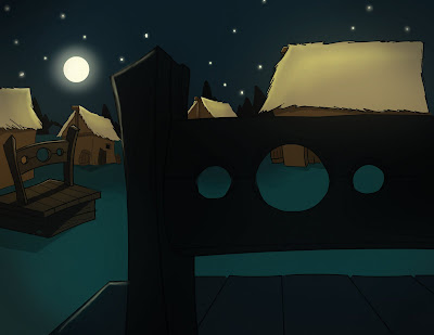
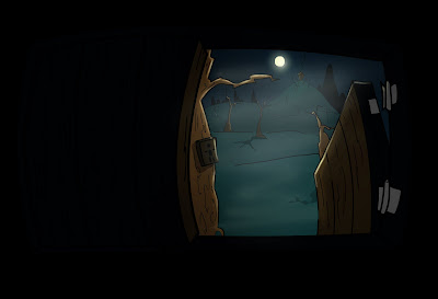
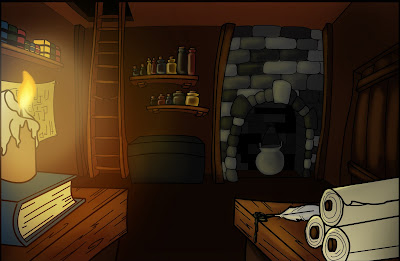
This is the sketch I started my background from. I started with three sheets of 11x17 tracing paper and drew the foreground on one, Middle ground on the second, the background on the third one. This way I could scan these in and color them on separate layers and eventually do some camera movements within my background.
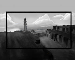
I decided to gray scale my picture out so that I could get all of my values. ALso the BG, MG, and FG is separated.
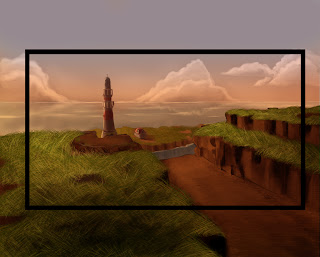
First, I applied two gradients on their own separate layers to set the mood (starting at orange at the top and yellow at the bottom). I switched the blending mode on the second layer to multiply to pick up a lot of the values that I laid down, when I was doing the gray scale. Then, on the first layer, I changed the blending mode to soft light to make the gradient pop out a little. I also added a little blue to the top of the sky on a separate layer because I felt it need some contrast with all the warm colors I used. I did a lot of other things to make this pic come to this point, so if you are interested in the other techniques I used, just let me know.
Little Boy Walk Backgrounds
Media: Flash for the line art and Photoshop for the coloring
Chubby Angel Backgrounds
Morning!!!! Well Here is some backgrounds for my Chubby Angel Animation. All of them were painted on Photoshop.
I made this wide view so I could zoom in and out if I need or pan left or right.

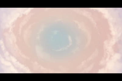
My main reference for the backgrounds was Hercules and All Dogs go to Heaven. I also used this tutorial to help me make the clouds.http://browse.deviantart.com/?qh=§ion=&global=1&q=Pixar+Clouds#/d23lozh
Visual Development Project
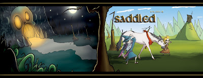
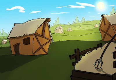
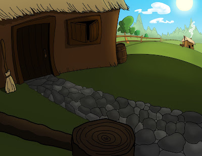
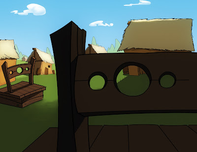
Good Morning! These are some of the backgrounds I painted in my Visual Development class. Digital painting is so much fun. Woooo!!!! I did not Draw any of these backgrounds. They were drawn by Mr. Christopher Alvarez. http://christopher-alvarez.blogspot.com/ Anyways that's it for now. Oh ya, the characters on the cover page was drawn by Mr. Mike Rovinsky
Media: Photoshop
